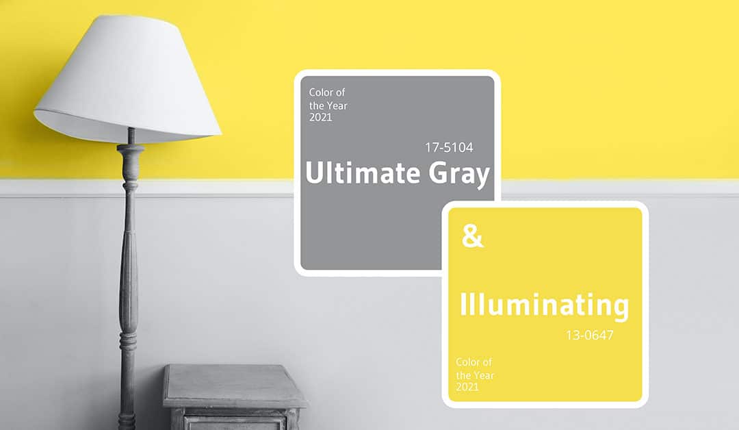
This year the Pantone Color Institute surprised us all. Instead of presenting the 2021 Pantone color of the year, they announced two different colours: PANTONE 17-5104 Ultimate Gray + PANTONE 13-0647 Illuminating.A combination of colours, yellow and grey, capable of perfectly complementing each other. A message that Pantone was keen to send to everyone: we are in this together!After a year like 2020 that forced us to face a global pandemic, the Pantone Color Institute, has clearly tried to offer us a message of strength and positivity using these two solid but also warm and optimistic colours.
Yellow’s vitality and Grey’s solidity
It was certainly the right moment to give people a sign of courage and come up with something new, a message that could give everyone with energy and hope thanks to these strong colours.
- PANTONE 13-0647 Illuminating: a warm and bright colour, that could instil energy and vitality
- PANTONE 17-5104 Ultimate Gray: grey capable of summoning feeling of stability and strength
Leatrice Eiseman, executive director of the Pantone Colour Institute:
“The mix of a time-stable Ultimate Gray and the vibrant yellow Illuminating expresses a message of positivity supported by great strength. Concrete and firm, but at the same time warm and optimistic, this colour combination conveys a sense of resilience and hope. We need to feel encouraged and relieved; it’s something essential for the human mind.”
Personalize palettes for Interior Design
On the official site Pantone.com, we can find personalized palettes and suggestions about other colours to match 2021 Pantone Colours.Thinking about interior design, these two colours can be suitable for any room, regardless of the style of furniture chosen.Let’s take a look at four suggested palettes, perfect for finding new inspiration for our home.
Palette Aviary
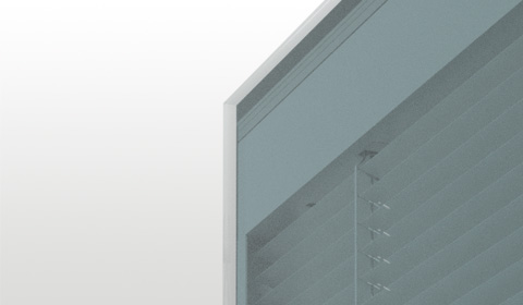
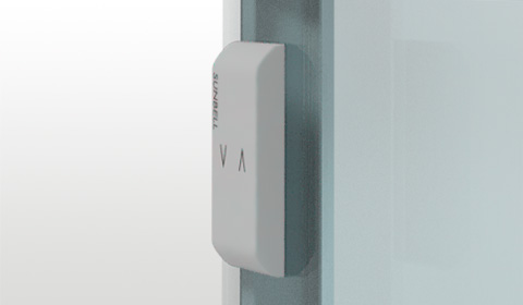
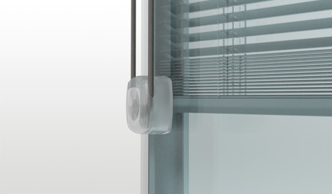
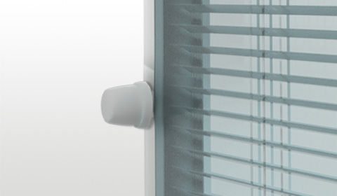
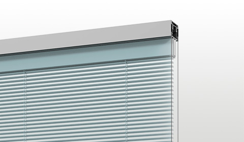
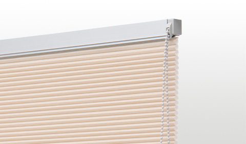
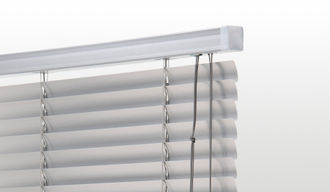
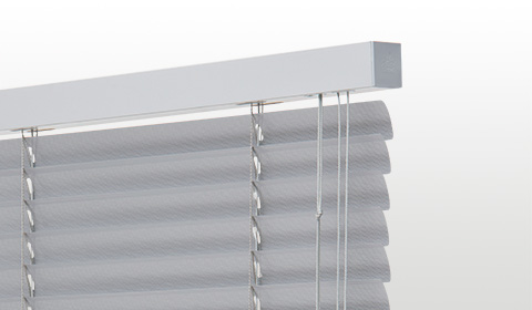
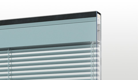
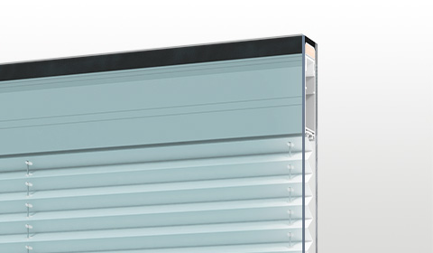
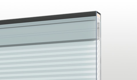
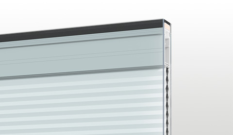
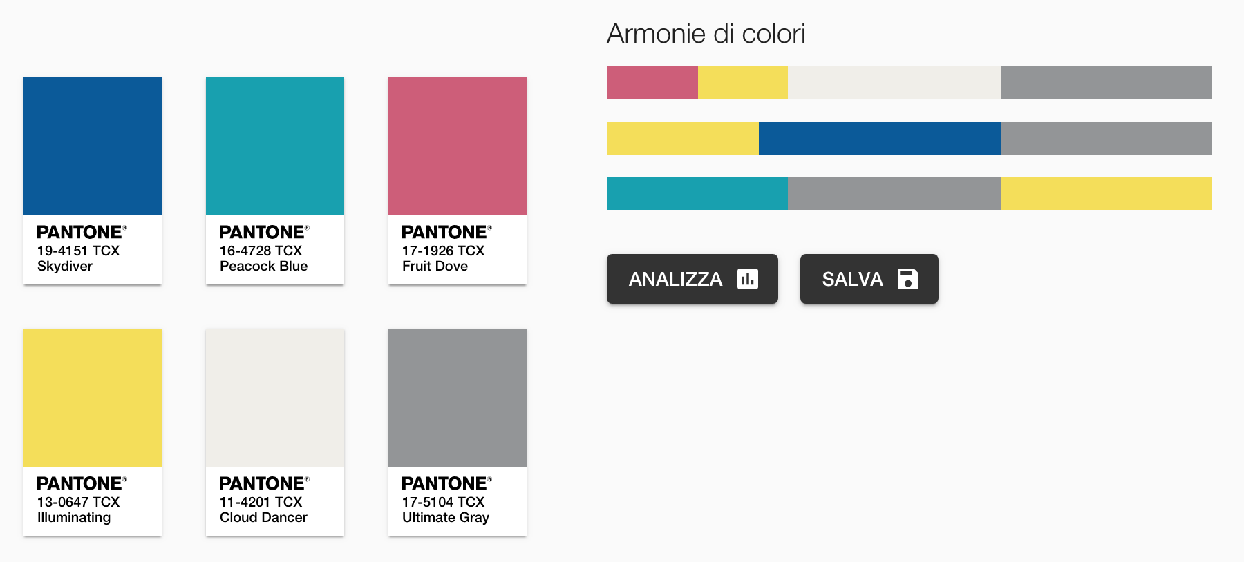 The Palette Aviary is composed of lively, bright colours full of energy, reminiscent of exuberant and exotic birds.In this case, PANTONE 17-5104 Ultimate Gray e PANTONE 13-0647 Illuminating are perfectly enhanced by strong shades of big characters such as Peacock Blue and Fruit Dove.To add an interesting element, you could add Cloud Dancer white to create a contrast of big visual impact.This Palette Aviary can also be adapted to a more contemporary style with a touch of eccentricity.If you are currently thinking of changing your blinds and with this palette in mind, you could try our double-glazing Venetian blinds with Suncord, Suncen, Up&Down e All in One in tonalities like 051, 052 or 053.
Palette Enlightenment
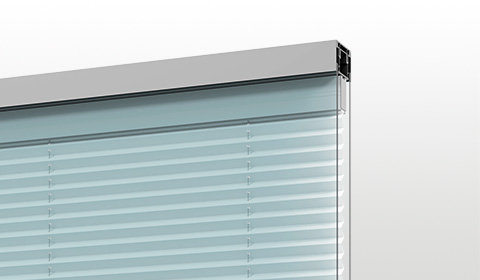
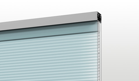
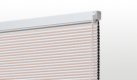
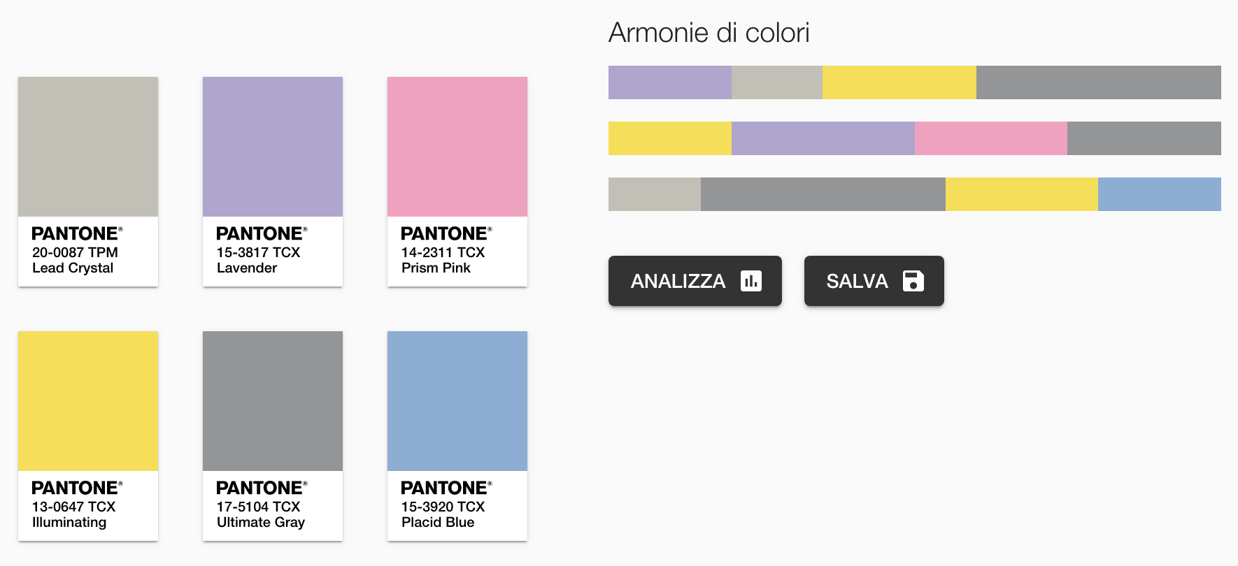 This palette is ideal for anyone who wants to reinvent and modernize their home.This selection of colours aims to bring a touch of youth and hope in the future, and that’s why these shades are particularly suitable for rooms where teenagers and young people spend much time.PANTONE 17-5104 Ultimate Gray and PANTONE 13-0647 Illuminating are associated with Lavender, Prism Pink and Placid blue.The desire to venture into young and dynamic worlds is also fulfilled by a metallic silver type of colour, Lead Crystal, reminiscent of moonlight.For your blinds, you could choose one from our Crystal lines, with the option of going for a Venetian blind, duet or plissé.
Palette Intrigue
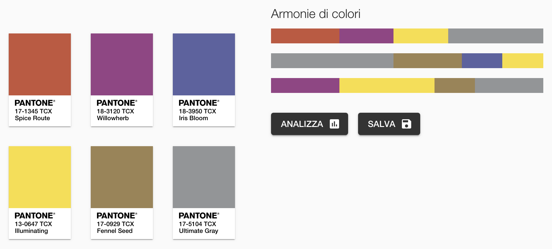 This palette offers an interesting alternative to the previous two because as well as being eccentric and youthful, it also possesses a timeless and universal charm.A mix of captivating and warm colours to go with PANTONE 17-5104 Ultimate Gray + PANTONE 13-0647 Illuminating like Spice Route, Willowherb, Iris Bloom e Fennel Seed.This palette is perfect for a house decorated in country style or if you want to make your home warmer and cosier.Regarding blinds matching these colours, you should go for our Iconic Wooden line with a palette of original colours and pair with natural matt varnished woods.
Palette Sun and Shadow
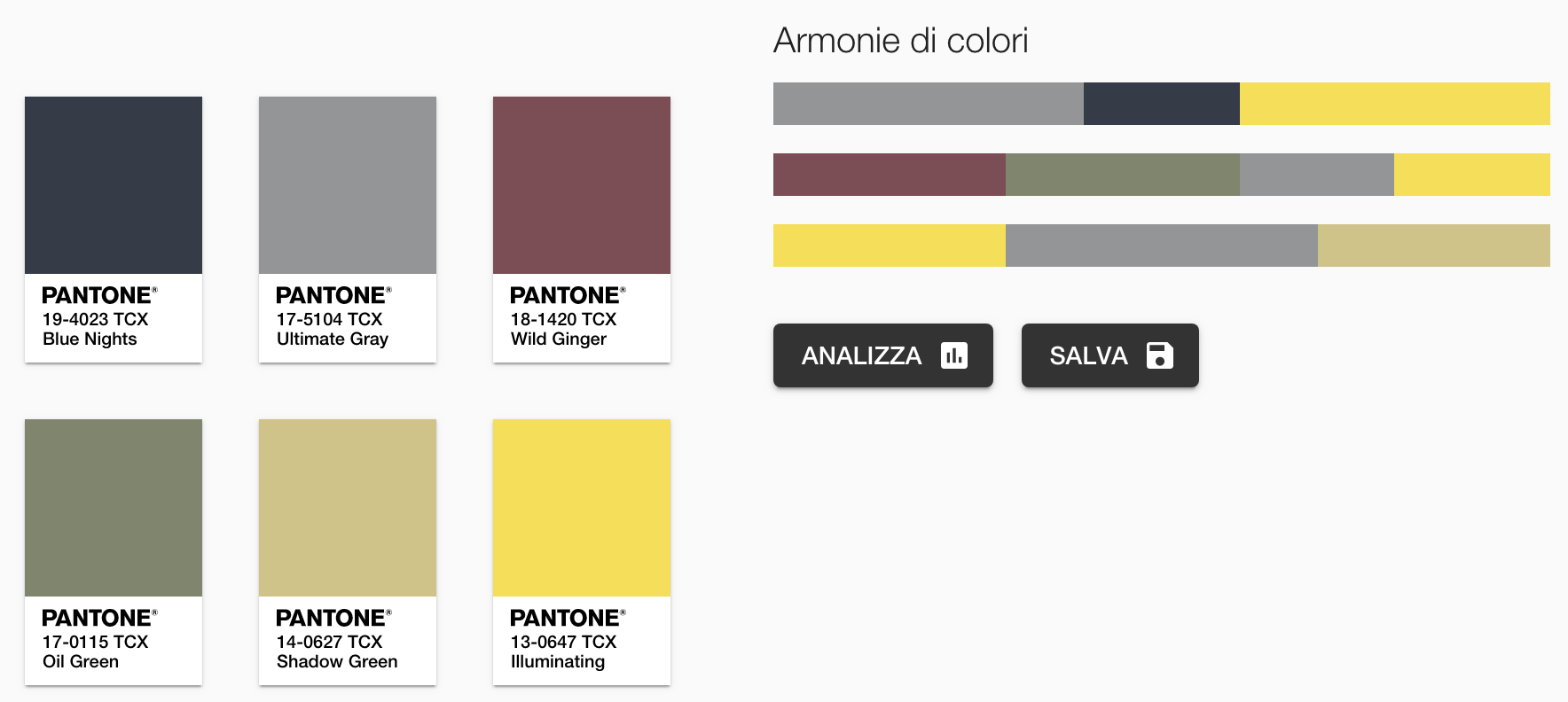 This colour palette is dedicated to the idea of resilience and hope represented by PANTONE 17-5104 Ultimate Gray + PANTONE 13-0647 Illuminating, matched with earthy tones.Colours like Blue Nights, Wild Ginger, Oil Green and Shadow Green tells the story of a primordial, warm and trustworthy type of beauty.Suitable for classic interior design, this mix of colours helps create a sense of strength, stability, and security.Even in this case, our wooden Venetian blinds will be a perfect match for this palette, but another great alternative could be roll-ups in natural cotton.
Conclusions
As we discussed, the two colours selected by the Pantone Color Institute can certainly be used and matched with other shades to revitalize and enhance our interiors.The choice to use PANTONE 17-5104 Ultimate Gray + PANTONE 13-0647 Illuminating is ultimately a message of hope and courage sent by Pantone, but that can also come from our homes – places that, this year, we have lived and experienced like never before.

