Designers of outdoor environments work on projects which are constantly evolving, as plants grow, environmental conditions change and people use the spaces.
For this reason, they must systematically consider all aspects of the land, the environment, the plants and the needs of the end-user, to ensure a visually pleasing, functional and ecologically healthy design.
Given this, the design process begins by determining the needs and desires of the user, but also the conditions of the site.
Once this information has been gathered, the designer proceeds by organising plants and materials, which are collectively referred to as the “features”.
These features can be physically described by the visual qualities of form, line, colour, texture and visual weight, which are the basic elements of the design.
The Basic Principles of Landscape Design
The basic principles for the design of external environments relate to the fundamental concepts of proportion, order, repetition and unity, which serve as guidelines to organize the “features” to create a landscape that is aesthetically pleasing and functional.
In the publication “Basic Principles of Landscape Design”, Dr Gail Hansen, a professor and researcher at the University of Florida, Institute of Food and Agricultural Sciences Extension, describes each of the four basic principles and their application.
As mentioned already, a harmonious composition can be achieved through the application of four basic principles:
- proportion;
- order;
- repetition;
- unity.
All the principles are related, which means that the application of one is a prerequisite to the achievement of the other.
Through the appropriate use of these principles, two important concepts in design are achieved:
- physical comfort;
- psychological comfort.
People feel more comfortable in a landscape that has order and repetition, since predictable patterns are easier to understand, and an environment with proportions compatible with human scale helps one to feel more secure.
Let’s look into it further.
1. Proportion
Relative proportion is the size of an object in relation to other objects, while absolute proportion is the scale or size of an object.
An important absolute scale in design is human scale – that is, the size of the human body – because the size of other objects is considered in relation to man.
Plants, exterior structures and ornaments, as well as buildings and areas to be designed, should be considered relative to human scale.
Proportion can be found in plant material relative to people, the surrounding plants and the house.
When all three are in proportion, the composition feels balanced and harmonious.
A feeling of balance can also be achieved by having equal proportions of open space and planted space.
The use of plants of different sizes can help to achieve contrasts, while using plants that are similar in size achieves a comforting rhythm through repetitions.
Human scale is also important for psychological well-being in open spaces.
People feel safer in small open spaces, such as patios and terraces, or in places that have an implied ceiling.
Spatial comfort does not necessarily come from a solid enclosure, in fact, an implied ceiling, like the branches of a tree, serves as an excellent psychological enclosure that still allows one to see the light and the sky.
2. Order
Order generally refers to the organization of the design and is most often achieved through balance, which can be:
- symmetrical;
- asymmetrical;
- perspective.
Order can also be achieved by massing features or elements into distinct groups and arranging them around a real or imaginary central point.
Symmetrical balance is achieved when the same objects are placed on either side of an axis in a mirror image.
This type of balance is one of the oldest concepts of spatial organisation since the mind naturally divides space by assuming a central axis and then seeks an even distribution of objects or mass.
Many historical gardens are organised using this concept.
Asymmetrical balance is achieved by equal visual weight of nonequivalent forms, colour, or texture on either side of an axis.
This type of balance is informal and is usually achieved by combinations of plants, structures and ornaments.
Perspective balance is concerned with the balance between the foreground, the midground and the background.
When looking at a composition, generally the objects in front have greater visual weight because they are closer to the viewer.
This effect can be balanced by using larger objects and lighter colours in the background.
3. Repetition
Repetition is created by the repeated use of elements or features, to create patterns or sequences.
Repeating lines, forms, colours and textures creates rhythm in the landscape, but it must be used with care: too much repetition can create monotony, and too little can create confusion.
Simple repetition is the use of the same object in a line or the grouping of a geometric form, such as a square, in an organised pattern.
Repetition can be made more interesting by using alternation, which is a small change in the sequence on a regular basis.
Inversion is another type of alternation, in which selected elements are modified so that the characteristics are opposite to the original elements, such as a row of vase-shaped plants and pyramidal plants in an ordered sequence.
Gradation is the gradual change of certain characteristics of a feature to make repetition more interesting, such as a square shape that gradually becomes smaller or larger.
4. Unity
Unity is achieved by linking elements and features to create a consistent character in the composition and is sometimes also referred to as harmony.
This principle is achieved by using four features to arrange colours, textures, and form:
- dominance: the ability of a plant or object to draw attention;
- interconnection: the ability to merge all of the features in a unified manner;
- unity of three: features that are grouped into threes, or in other groups of odd numbers, feel more balanced to the eye and give a strong sense of unity, also because they are not visually divisible as easily as even numbers;
- simplicity: reducing or eliminating non-essentials to avoid a chaotic look.
The simplest way to create unity is through the use of a theme or a visually pleasing design style.
Conclusions
The design of the external environment requires knowledge of the elements and principles of design, to be able to apply and handle the challenges and opportunities that each site presents.
Added to that is the architectural component of the building or house, which must be consistent with the work carried out on external spaces.
Some elements of the house can be incorporated in the design of the exterior spaces, such as any bricks used for the façade, or the colour and material of the fittings.
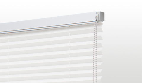
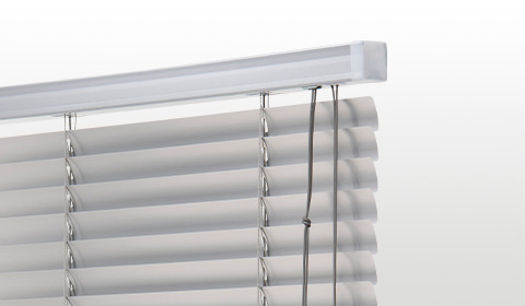
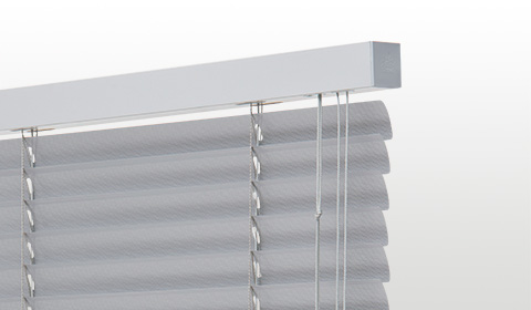
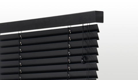
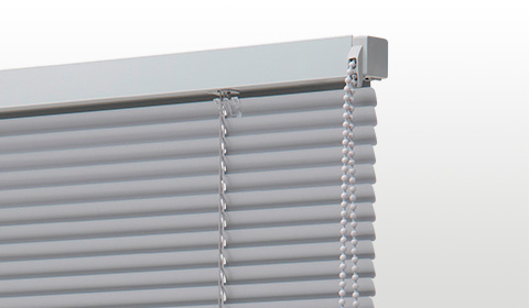
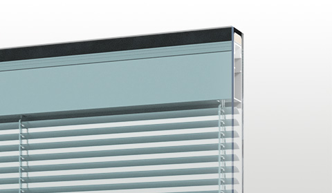
In this regard, aluminium venetian blinds are particularly suitable, a material that guarantees solidity over time and makes these blinds capable of elegantly furnishing both indoor and outdoor environments.

